 http://www.stats.indiana.edu/maptools/maps/thematic/indiana/luxurycars03.gif
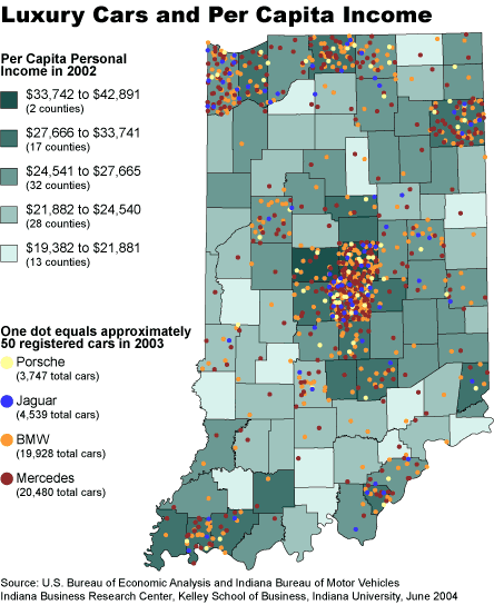
I particularly like this thematic map because it follows two data streams and manages to depict them each clearly. This particular map chooses to use a Choropleth Map to represent the average distribution of income. This base is overlapped with a Dot Distribution map with multiple colors to represent various high-end cars. This combination of grey-tone (well, greenish-blue tone) and colored dotes allows the observer to see the correlation between income and luxury car sales with relative ease. Overall I found this to be a decent representation of the thematic map.


