 The above image, taken from start1.jpl.nasa.gov/caseStudies/autoTool.cfm, shows the target information and the results of four designs for a Mars Rover arm assembly at NASA. The target parameters for the arm are shown in red. This view allowed the workers to compare the designs along seven different parameters on a single graph. In some ways the graph is similar to the parallel coordinate graph, only with the coordinates sharing an origin.
 Wednesday, July 30, 2008
Star Plot
The above image, taken from start1.jpl.nasa.gov/caseStudies/autoTool.cfm, shows the target information and the results of four designs for a Mars Rover arm assembly at NASA. The target parameters for the arm are shown in red. This view allowed the workers to compare the designs along seven different parameters on a single graph. In some ways the graph is similar to the parallel coordinate graph, only with the coordinates sharing an origin. Correlation Matrix
 The above image, taken from http://www.imed.jussieu.fr/niveau1/e1/htdocs/English/afficherTheme.php?noTheme=7, is a correlation matrix from a functional MRI. The goal was to determine the correlation between different regions of the brain in order to help with mapping brain function. In this case warm (yellow to red) colors indicate positive correlations whereas cool (blue) colors indicate negative correlations.
 Similarity Matrix
 The above image, taken from tomcat.esat.kuleuven.be/txtgate/tutorial.jsp, is a similarity matrix for selected genes from an organism. In this case dissimilar genes are indicated by green and higher levels of similarity (in terms of number of building-block clusters-DNA sequences) are indicated by increasing intensities of yellow-orange-red. The solid red line indicates where a given gene intersects itself (100% similarity). There is a grouping of similarity at the lower right, but also some individual similarities scattered around the matrix.
Stem and Leaf Plot
 The above image, taken from http://math.albany.edu/~reinhold/m308/Assgnmt1_HowTo_files/lectu0textbox17.gif, shows a stem and leaf plot for adult height in inches and tenths of an inch. As would be predicted, one cans see a fairly normal bell curve developing in the data. While this type of plot gives the viewer both an idea of the distribution of data, it also provides access to the raw data. It should be noted, however, that if one leaf is heavily populated by high numbers and the neighboring leaf is populated by low numbers, it is possible to have gaps in data that are not represented in the overall outline of the plot.
Box Plot
 The above image, taken from http://www.onlamp.com/php/2004/07/22/graphics/boxplot.jpg, shows box plot data from a study looking at the relationship between anxiety level and test score. Interestingly, those with higher anxiety seem to have done better on the test. Perhaps the anxiety let to more study time. Of course, it could just be that those that care about grades tend to study more and be more anxious about them. It would not seem to indicate that studying lowers anxiety or that anxiety is extremely detrimental to test-taking performance.
Histogram
 The above histogram, taken from http://www.tms.org/pubs/journals/JOM/0312/Rickman/fig2.gif, shows the results of a study in which the number of times a coin landed on "heads" when flipped ten times. In this study the exercise was conducted 3,000 times. Also shown are the predicted outcomes from a simulation. The result of an equal-chance histogram such as this will always be a bell shaped (Normal) curve.
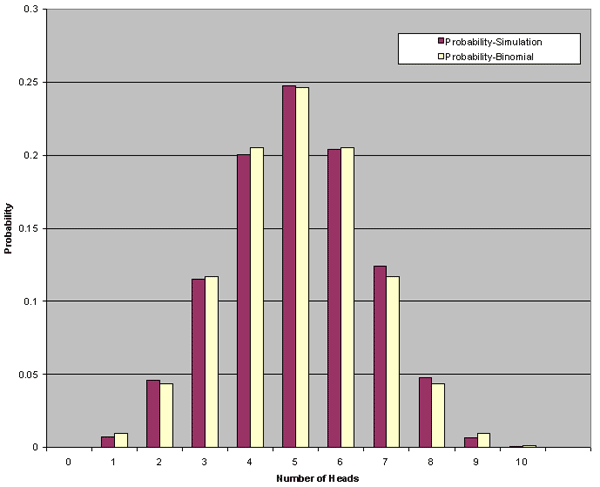
Parallel Coordinate Graph

The above image, taken from http://www.geovista.psu.edu/publications/JSM99/Image53.gif, shows a parallel coordinate graph for a weather phenomenon. The crater has chosen to highlight the green data tracks in order to bring forward the information presented. This type of graph can help users find trends and commonalities between separate data streams that might otherwise go unseen. For instances, there is a grouping of the green lines at the last coordinate that may need some attention on this graph.
Subscribe to:
Comments (Atom)