 This map can be found at:
http://blog.thematicmapping.org/2008/03/first-thematic-map-examples.html?widgetType=BlogArchive&widgetId=BlogArchive1&action=toggle&dir=close&toggle=MONTHLY-1212274800000&toggleopen=MONTHLY-1212274800000
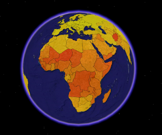
The above map is a choropleth map depicting fertility rates of the world. (view limited in picture). The data is children per woman and is lowest in the lighter (yellow) areas and increased to the darker (red) areas. The picture is of a KLM file used as a layer on Google earth. More information, as well as another model with simulated 3-D, is available at the above link.
No comments:
Post a Comment