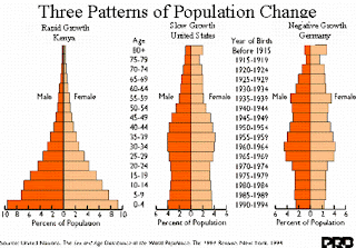
 The above image, taken from http://www.uni.edu/gai/India/India_Lesson_Plans/India_Population_Pyramids_files/image002.gif,
shows the most common versions of the population profile. These graphs give a rapid way of looking at the make-up of an areas population. Areas with high birth and death rates (such as sub-Saharan Africa and other "third-world" areas) tend to look more like the first "bottom heavy" representation. As countries develop and medical and social services improve these countries tend to migrate towards the right in these graphs. Births per capita tend to decline while the percentage living longer tends to increase. Countries such as the US, where births have fell since the baby boom and many more people are living longer we find representations that look more like the graph on the right. The graph also shows male vs. female ratios on each side of the mid-line of the graph.
No comments:
Post a Comment