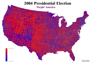
The above image, the well-known "Purple America" map depicts the ratio of votes cast in the 2004 presidential election. Robert J. Vanderbei chose this representation to show a more accurate picture of Democrat versus Republican votes cast. While the typical election map shows the red or blue of the winning party (a 2-class classed choropleth), this image has an infinite number of blue-purple-red colors to show the true diversity of the county.
No comments:
Post a Comment