 The above image, taken from http://www.rethinkingschools.org/archive/19_03/inte193.shtml, shows a basic Lorenz Curve for income distribution in the United States. The bottom curve represents actual distribution. By looking at this graph we can see that the bottom 80% of families account for only around 50% of the total income. The shape of this curve shows us that a disproportionately small number of individuals make considerably more than the norm, while others at he bottom make considerably less. In a society where total equality was achieved, one would find the line shown at the top, this represents a society where everyone makes the same.
Wednesday, July 30, 2008
Accumulative Line Graph or Lorenz Curve
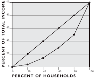
 The above image, taken from http://www.rethinkingschools.org/archive/19_03/inte193.shtml, shows a basic Lorenz Curve for income distribution in the United States. The bottom curve represents actual distribution. By looking at this graph we can see that the bottom 80% of families account for only around 50% of the total income. The shape of this curve shows us that a disproportionately small number of individuals make considerably more than the norm, while others at he bottom make considerably less. In a society where total equality was achieved, one would find the line shown at the top, this represents a society where everyone makes the same.
Subscribe to:
Post Comments (Atom)
No comments:
Post a Comment