Wednesday, July 23, 2008

Flow Map

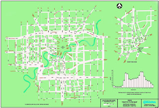
The above map can be found at http://www.edmontonprt.com/Public%20Transit%20in%20Edmonton.htm

The map depicts the traffic flow patterns in Edmonton, Canada. the depiction shows traffic volume by correlating the with of the depicted road with actual traffic volume. The map also includes a bar graph indicating overall flow by time of day. The Double peak shows the typical "rush hour" traffic. While the map gives a picture of overall usage, it does not necessarily give an idea of congestion or actual use at any given time. Obviously there are more influences on traffic flow than daily usage. This map does not indicate road type (i.e. limited access hwy, open access 2 lane, etc), type of usage (car, commercial shipping, bus), type of travel (in-town, through-traffic), nor does it indicate directionality of traffic. All of these could influence the actual picture of traffic at a given place and time.
Wednesday, July 2, 2008

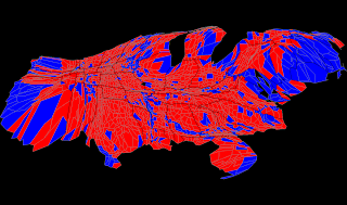
Cartogram


The above map can be found at: www.research.att.com/~suresh/cartogram/
The above cartogram, an adaptation of the "Robert Vanderbei's Purple Map" represents data in several different dimensions. Color represents the winning party in the 2004 presidential election (red = Rep. Blue = Dem, of course) The lines mark the states (darker) and the counties (lighter). The relative size of the counties show the relative population. (larger area= larger population.

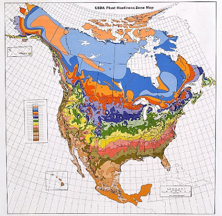
Isoline Map

The above map can be found at http://hwwff.cce.cornell.edu/content/unit2/images/usda-hardiness-zones.jpg
The above isoline map, in this case depicting different "vegetation hardiness zones" shows how different areas of similarity are connected. In this case the areas connected by isolines are the dividing lines between different vegetation hardiness. In all actuality the map is a continuum. The isolines mark the transition from one zone to another, however within the zone (in this case marked by different colors) one will find a range of the variable.

Proportional Circle Map


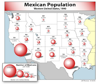
Above map can be found at http://www.neiu.edu/~jrthomas/377/circle.jpg
I chose the above map to illustrate both the positive use of a proportional circle map, as well as a easy to make mistake when designing maps. I applaud the mapmaker for color choice and multiple data representation. The circles are relatively easy to compare (other than one issue, which I will discuss shortly) and actual statistical data is provided along side. This provides easy overview with the ability to research further upon review.
The one issue I had with this map is the use of shading on the circles. While this is attractive in a cosmetic sense, it can be misleading. By providing depth to the circles, one creates spheres. If the circles are spheres, they are no longer representative. For a given diameter, the volume will increase at a higher rate than the area of the circle. This could lead to a miscommunication and an overepresentation in the larger states.

Choropleth Map

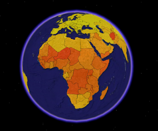
This map can be found at:

http://blog.thematicmapping.org/2008/03/first-thematic-map-examples.html?widgetType=BlogArchive&widgetId=BlogArchive1&action=toggle&dir=close&toggle=MONTHLY-1212274800000&toggleopen=MONTHLY-1212274800000

The above map is a choropleth map depicting fertility rates of the world. (view limited in picture). The data is children per woman and is lowest in the lighter (yellow) areas and increased to the darker (red) areas. The picture is of a KLM file used as a layer on Google earth. More information, as well as another model with simulated 3-D, is available at the above link.

Dot Distribution Map


The above map is a population density dot distribution map based on the 2000 census data. The map, in higher resolution, can be found at

Propaganda Map

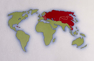
Can be found at www.dkimages.com/.../Russia/Maps/Maps-8.html


Can be found at http://img.dailymail.co.uk/i/pix/2007/06_01/russian0406_468x284.jpg


The above maps, one obviously more stylized than the other, both depict a type of pro-United States, anti-Soviet Union propaganda popular during the late 20th Century. The top map depicts the Soviet Union, and other communist countries, in a menacing red color. The bottom map, while showing less of the world, carries much more propaganda. The most noticeable aspect being the ICBM's shown in the atmosphere and the carrier with missile in tow on the bottom.