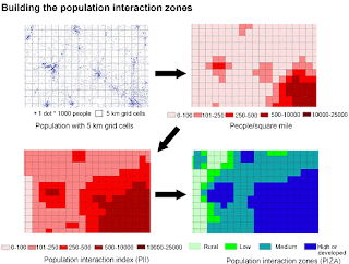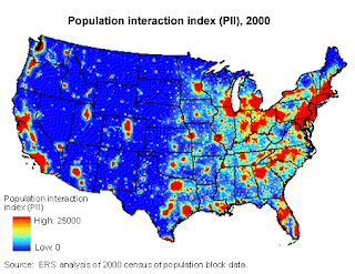
 The above images, taken from http://www.ers.usda.gov/Briefing/landuse/measuringurbanchapter.htm, show how a standardized choropleth map can be made to show population distribution in the United States. In this case the US was divided in to 1 mile squares (standardized). Each square was assigned a color equal to it's population. When viewed as a whole, the US looks seamless. When seen in close-up however, the individual segments can be seen. These types of maps can assist where unstandardized choropleths (political divisions for example) may be confusing.
No comments:
Post a Comment