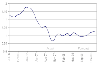
 Above taken from www.forecasts.org/cdollar.htm
Above taken from http://www.picotech.com/experiments/sound_interference/results.html
The two images above each represent a type of index value plot. The top image, a comparison of the Canadian dollar to the US dollar over time, is indexed on the value of the US dollar at any given time. Because, in this case, both the dollars are always changing we can not say how either compared to an outside reference such as the Japanese Yen or to an ounce of gold. Because the graph only compares the value relative to each other, there is no way to determine if they were both increasing, decreasing, or remaining relatively constant. In addition, we can not tell if the Canadian gained value or if the US lost value.
On the second graph, a depiction of a sound wave, we find a different calibration. The zero value on this graph represents ambient pressure. the oscillations show the movement of higher and lower than ambient pressure waves which where detected. The height of these show us the amplitude (volume), whereas the distance between peaks show us the frequency.

No comments:
Post a Comment