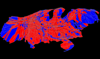
The above map can be found at: www.research.att.com/~suresh/cartogram/
The above cartogram, an adaptation of the "Robert Vanderbei's Purple Map" represents data in several different dimensions. Color represents the winning party in the 2004 presidential election (red = Rep. Blue = Dem, of course) The lines mark the states (darker) and the counties (lighter). The relative size of the counties show the relative population. (larger area= larger population.
No comments:
Post a Comment