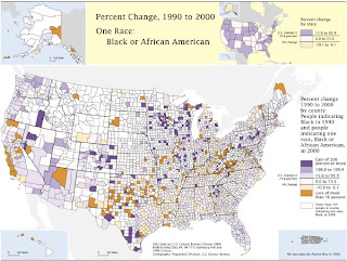
 The above image can be viewed at www.prisonersofthecensus.org/toobig/toobig.html
This map depicts the percentage change in the percent of African American population that is incarcerated. Note that the map does not depict the percent of the actual population, but rather the change in population represented due to changes in census procedures. This map came from a site showing the influence of criteria setting on data outcomes.
No comments:
Post a Comment