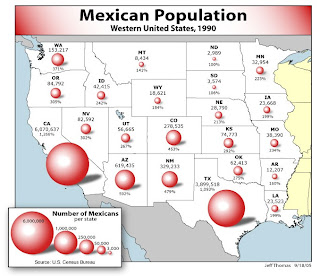
Above map can be found at http://www.neiu.edu/~jrthomas/377/circle.jpg
I chose the above map to illustrate both the positive use of a proportional circle map, as well as a easy to make mistake when designing maps. I applaud the mapmaker for color choice and multiple data representation. The circles are relatively easy to compare (other than one issue, which I will discuss shortly) and actual statistical data is provided along side. This provides easy overview with the ability to research further upon review.
The one issue I had with this map is the use of shading on the circles. While this is attractive in a cosmetic sense, it can be misleading. By providing depth to the circles, one creates spheres. If the circles are spheres, they are no longer representative. For a given diameter, the volume will increase at a higher rate than the area of the circle. This could lead to a miscommunication and an overepresentation in the larger states.
No comments:
Post a Comment